Overview
%20copy.png)
This was a 2-week project as part of my 3 month UX Design Bootcamp at General Assembly. I worked on a team with three other UX Design students to improve the existing app by uncovering the pain-points current users face when interacting with Geekwire’s current app.
My Role
Deliverables
Tools
-
UI Designer
-
UX Researcher
-
Affinity Map
-
Competitive & Comparative Analysis
-
Wireframes
-
User Testing
-
Prototypes
-
Figma
Discovery
Problem & Solution
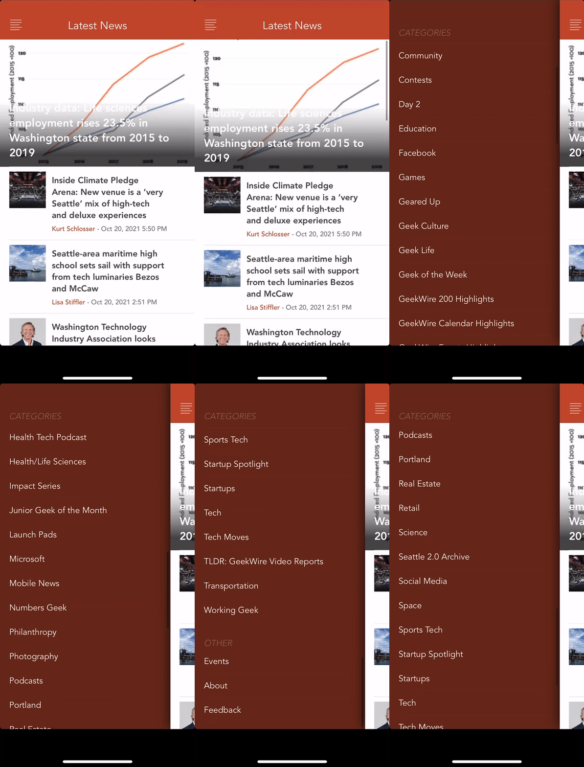
During our research, my UX design team and I discovered that GeekWire has not updated its mobile platform in over 3 years. We ultimately focused on restoring Geekwire’s app by solving its main usability issues. Through the exploration of its present user's pain points, we learned that we could simplify certain features and implement new iterations to the current app’s navigation function.
In order to gain a better understanding of who its users are and how its app operates, my team and I conducted user interviews and found six participants who were familiar with Geekwire's mobile platform. We found users vocalizing how the app's primary navigation had a lot of content to sort through, which made it frustrating to operate.
All of the users we interviewed stated the same, if not similar, comments on how the app's primary navigation had so much content to sort through. This made users feel overwhelmed and frustrated when they were looking to filter through news or find something specific they wanted.
We also noticed that users were either interested or enjoyed the podcast feature within the Geekwire app. They mentioned that it was disappointing how the app neglected this feature since it is too difficult to locate within the platform.
Define
-
I want a simple way to search or access topics
-
I like having the option to share the news with others
-
I read what's new and trending first
-
I enjoy visuals to give my news more context
-
I like having the option to listen to my news instead of reading it
We grouped the data points from our user interviews using an Affinity Map and chose five key insights to drive our design process. These points came up the most during our user interviews:
From this, we were able to develop a User Persona to embody Geekwire's primary user's needs, goals, and pain points. My Team and I also created a User Journey Map to better illustrate and understand where the opportunities lay when beginning iteration.
.png)
Hi, I'm Chris
Age: 24
Goals
-
To easily find and read articles he wants
Needs
-
Easy access to topics that interest him
-
Prioritized access to new/trending news
-
More than one way to browse
Painpoints
-
Deterred by not being able to search for topics
-
Doesn't want the experience to be too hard or challenging to sort through
User Journey
Feeling
Thinking
Doing

Unsure
Confused
Frustrated
Skeptical
"This app looks like it hasn't been updated for quite some time"
"Where is the search bar or a spy glass?"
"I've been searching for a while now...I don't think they have a search option?"
"Forget it, ill just look somewhere else."
Browsing the homepage and opens navigation menu
Clicking through all categories to find an option to search
Leaves navigation menu and scrolls through homepage
Exits app
Browsing
Searching
Abandoning
We then performed two types of analyses:
-
Heuristic Evaluation in order to get an understanding of the basic issues that were easily pointed out within the app
-
Competitive & Comparative Analysis to understand Geekwire's strengths and weaknesses in comparison to similar companies and to highlight key properties that can be applied to Geekwire's app during the design phase.
Competitive & Comparative Analysis

Design
My team held a series of 3 design studios where we sketched out low-fidelity wireframes for the main pages that we would include in the prototype in order to address Chris's problems. They included: a Navigation bar, a Homepage, a Filter Option, a Search Tab, a Podcast Tab, and a Profile Tab.
Lo-Fidelity Sketching


Permanent Navigation Bar
Easy to Filter & Search Topics
Create a Profile


Highlight Podcast Feature
Based on the insights gathered in our User Interviews, combined with what we learned through our Heuristic Evaluation and Competitive/Comparative Analysis, we built out a mid-fidelity prototype and tested it with potential users. The focus of this round of usability testing was to check for the functionality of our design before taking it up to higher fidelity.
We tested with our users and gave them the following goal & tasks:
Goal:
-
Navigate to their ideal subject
User Tasks:
-
Find a Tesla or Apple article to read
-
Find a podcast to listen to
All of our users completed both tasks that we gave them successfully. However, one issue that was brought up repeatedly was that the "Top News" filter function needed to be better understood as a filtering option. We changed the carrot to say "Filter" in the hi-fidelity mock-up.
Hi-Fidelity Prototyping + Usability Testing


Deliver
Within the two-week design sprint, my team and I covered a lot of ground in the research and redesign phases of the Geekwire app. Despite this being a concept project, we delivered a high-quality product and presented our key findings.
Before

After

Key Takeaways
With more time and resources we could have taken the recommendations suggested and continued onto the redesign of optimizing a positive user experience. Below are the most prominent recommendations that resulted from our sprint.
Time: Despite having 2 weeks, I think my team and I did a really great job collaborating and getting our ideas down in a fast and clear way.
Testing: I think we could have gathered more users to interview and test our prototype.
Feature Integration: Further down the line, we could have released new features to continue to improve the user’s experience and retention such as "night mode" for visual ease.


.png)


.png)